CASE STUDY
Setting vision for the product roadmap
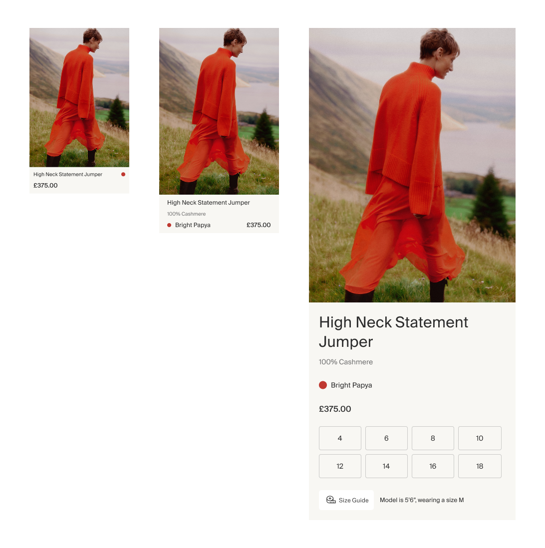
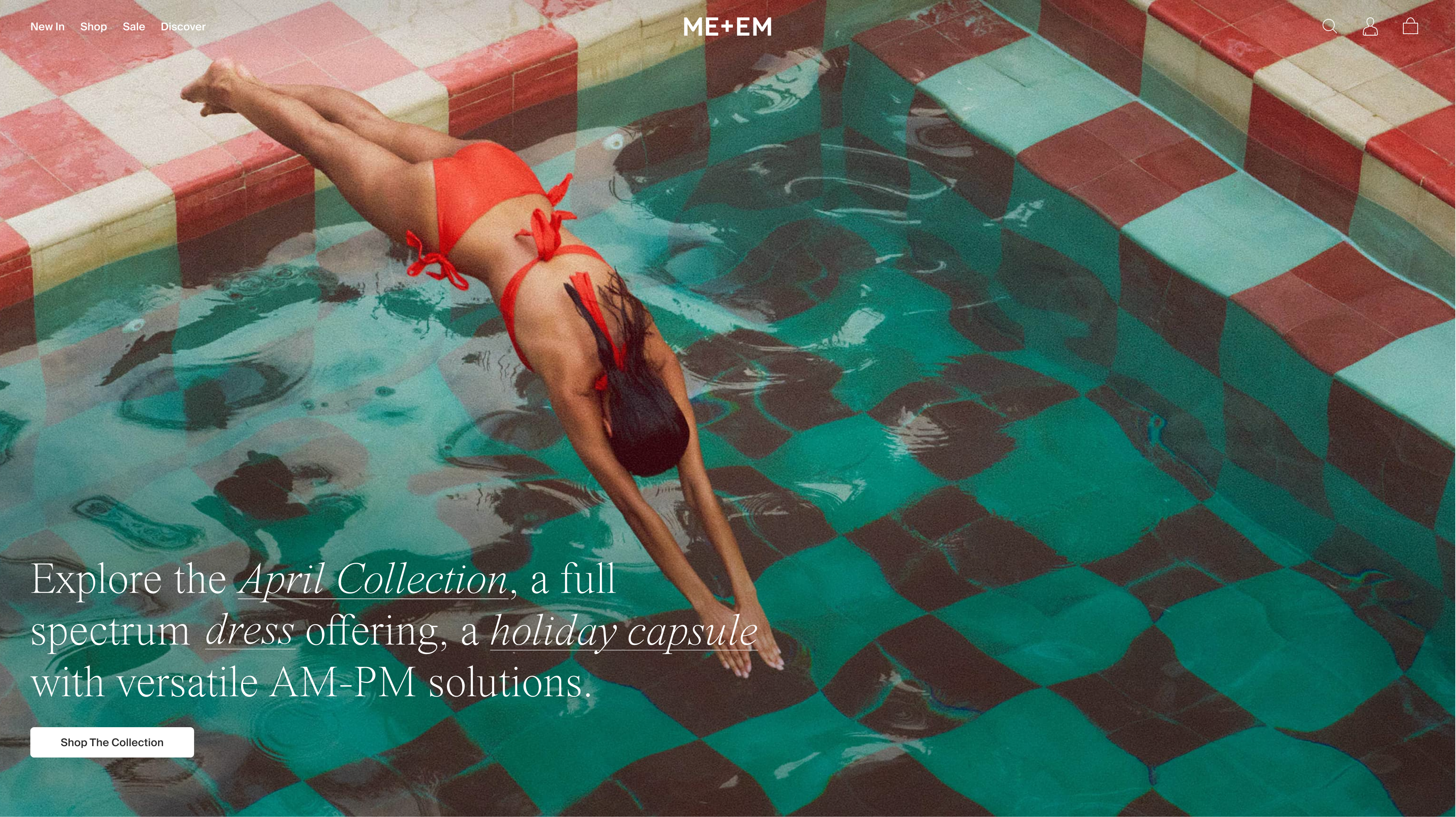
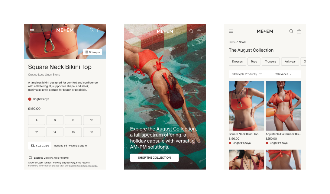
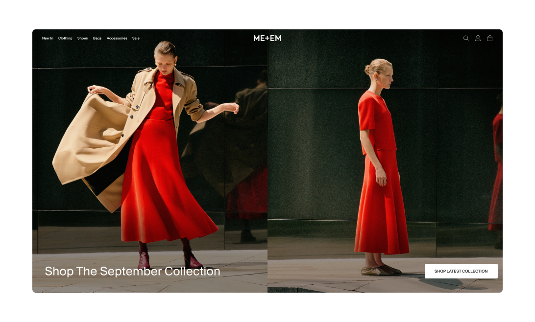
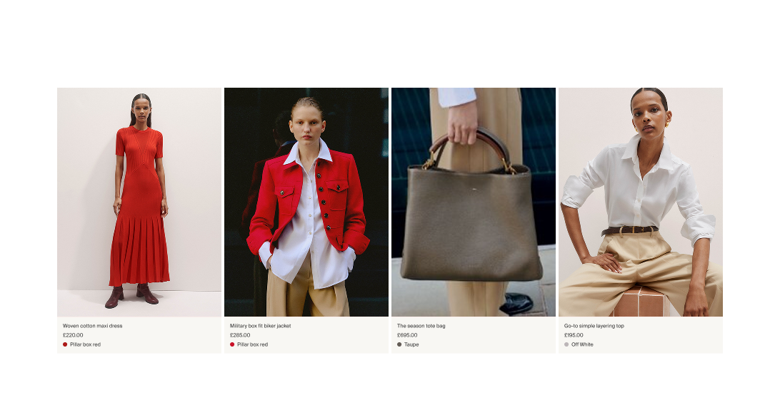
A new visual direction for every surface of ME+EM’s digital experience — aligning brand pillars while capturing the essence of stores, lookbooks, and most importantly the clothing.
👨💻 My Role: Hands-on Product Design Director
“The site feels clean, I have a clear view of where to go, it’s not busy.”
ME+EM has a strong identity in its collections, stores, and lookbook. However, the website needed modernising to that truly reflected the brand’s pillars and the quality of its clothing.
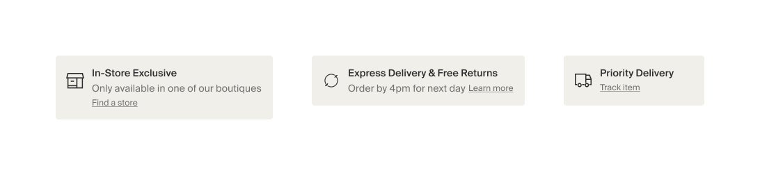
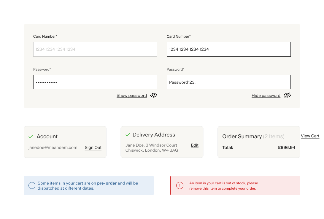
As we worked through technical and UX improvements, it became clear we also needed a north star for design — a visual direction that could guide the digital experience over the coming years.
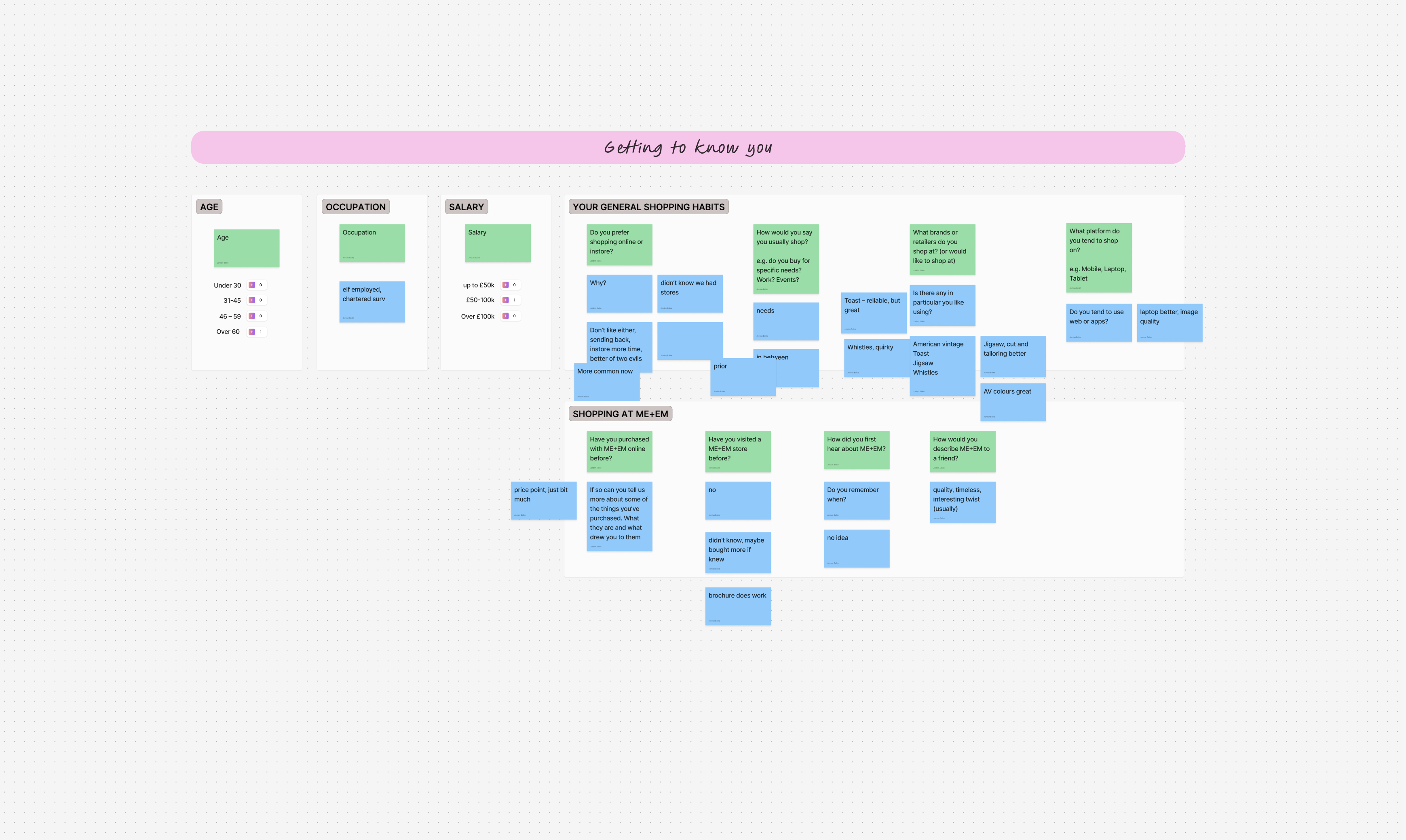
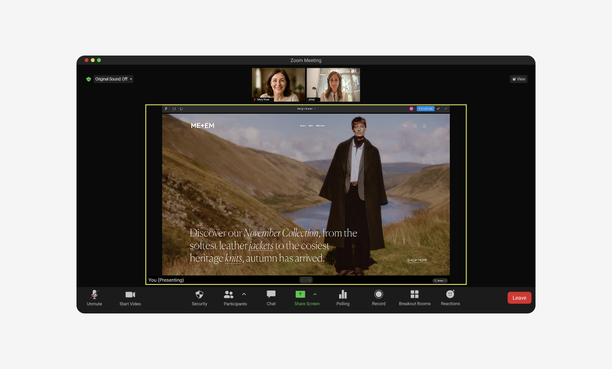
👂 Listening To Customers First
We conducted in-depth interviews with new, existing, and VIP customers across the UK and the USA (East and West Coast). These conversations gave us a rounded view of different customer journeys, needs, and expectations, helping us shape design decisions with a truly global perspective.
“I feel unstoppableas a woman in ME+EM”
“People are always askingme where I got this.”
“I never stopgetting compliments”
“...empowering shapeand cuts”
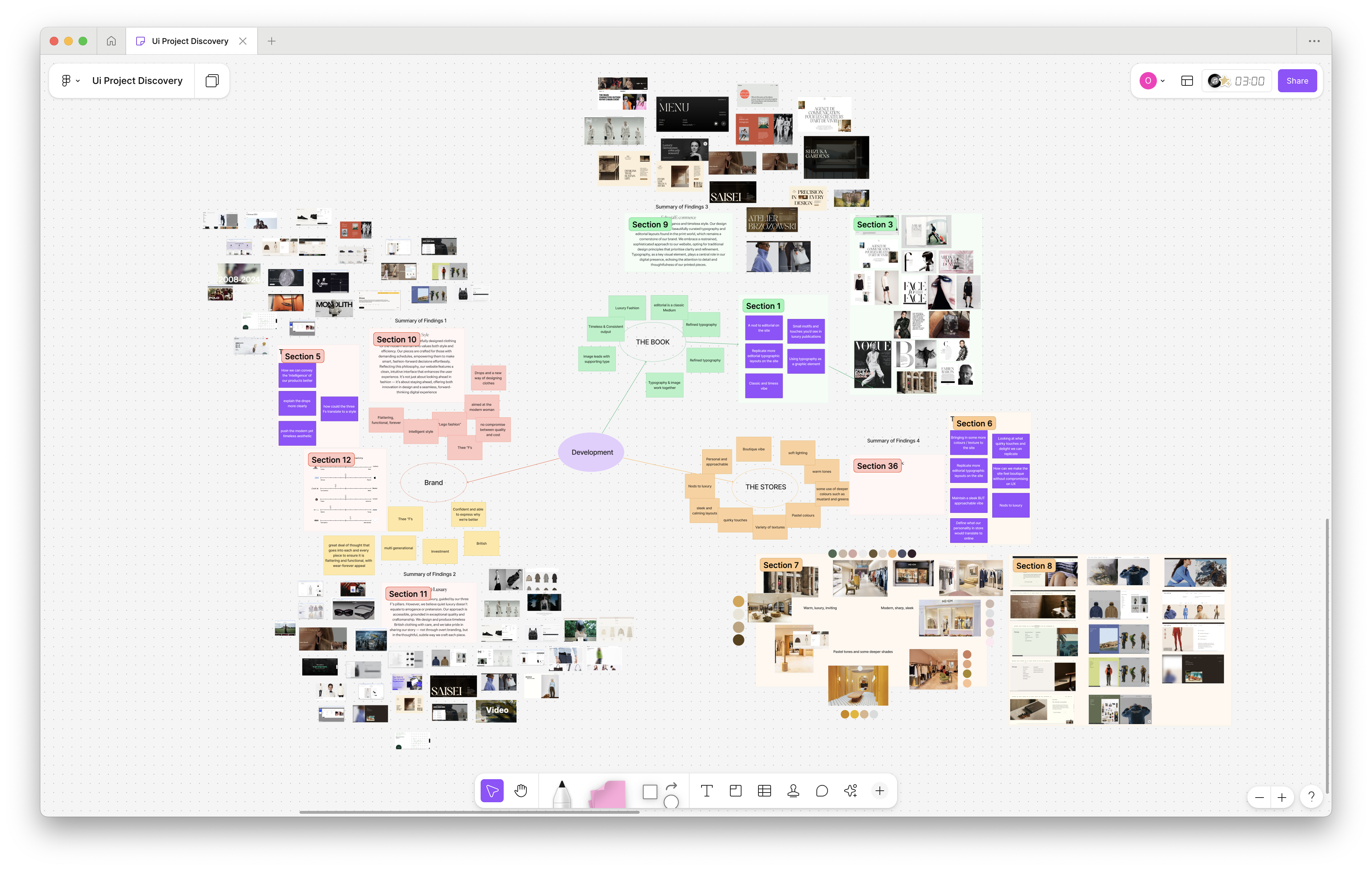
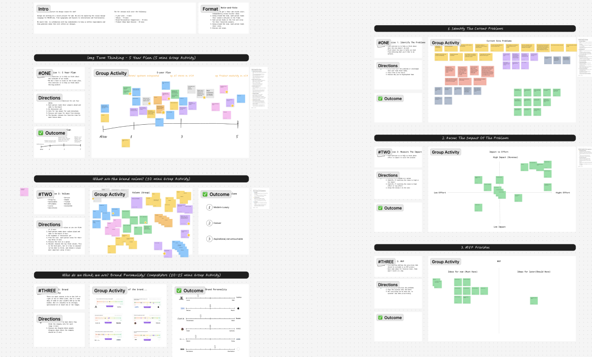
Shaping Strategy With Stakeholders
To align the business around a shared vision, I led workshops with garment, e-commerce, brand, and technology teams, alongside one-on-one founder interviews. This process surfaced priorities across departments, built alignment, and ensured design decisions reflected both business goals and brand ambition.
🎯 Defining Clear Creative Goals
- Define a clear visual identity for ME+EM online.
- Focus on brand image and storytelling rather than new features.
- Plan for seamless integration into future roadmap initiatives.
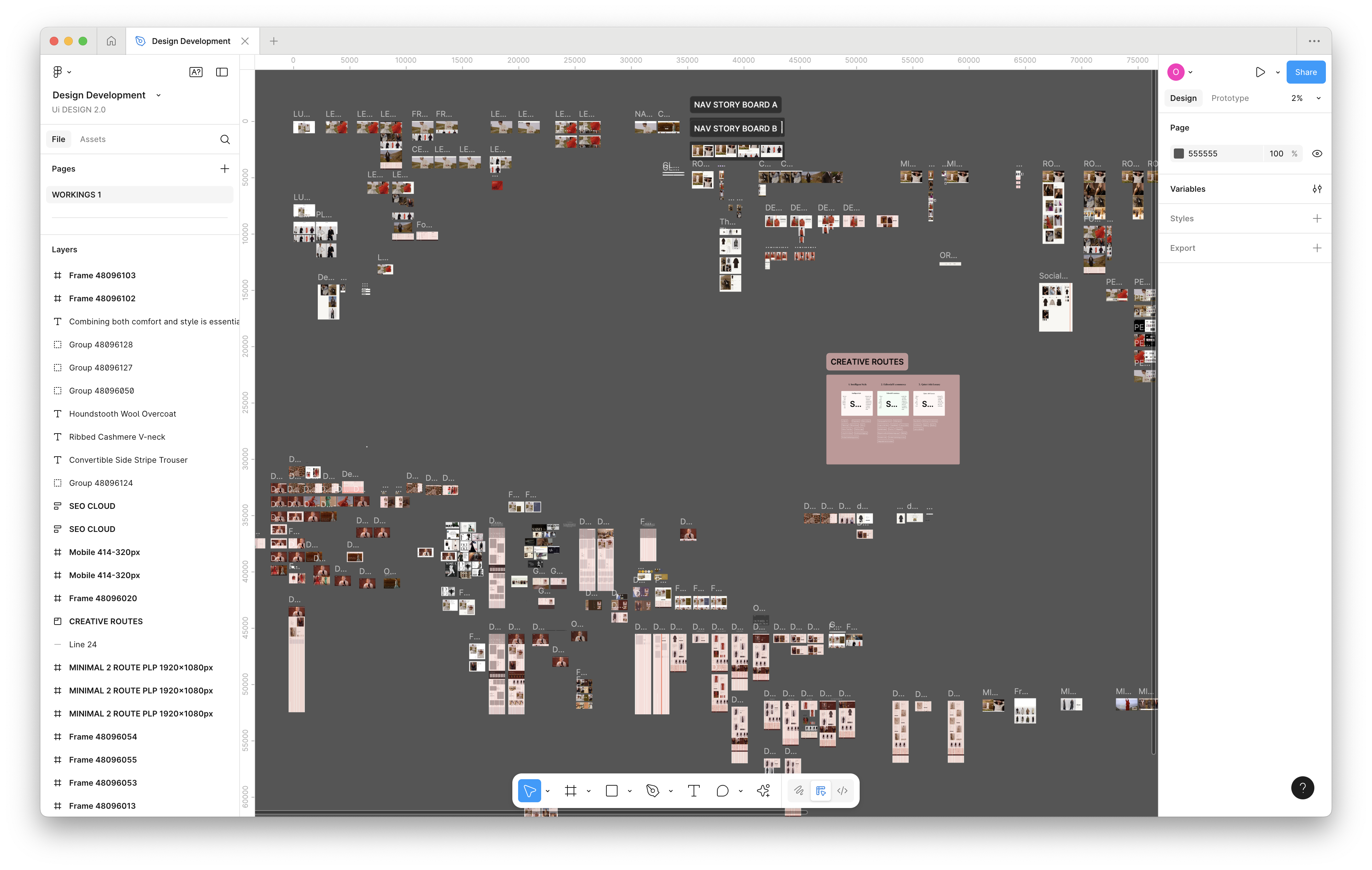
Design Discovery
Exploring direct competitors and market leaders, as well as drawing inspiration from innovative emerging brands across sectors.
💡Strategic Solution
Brining ‘Intelligent Style’ to the every surface across the web.

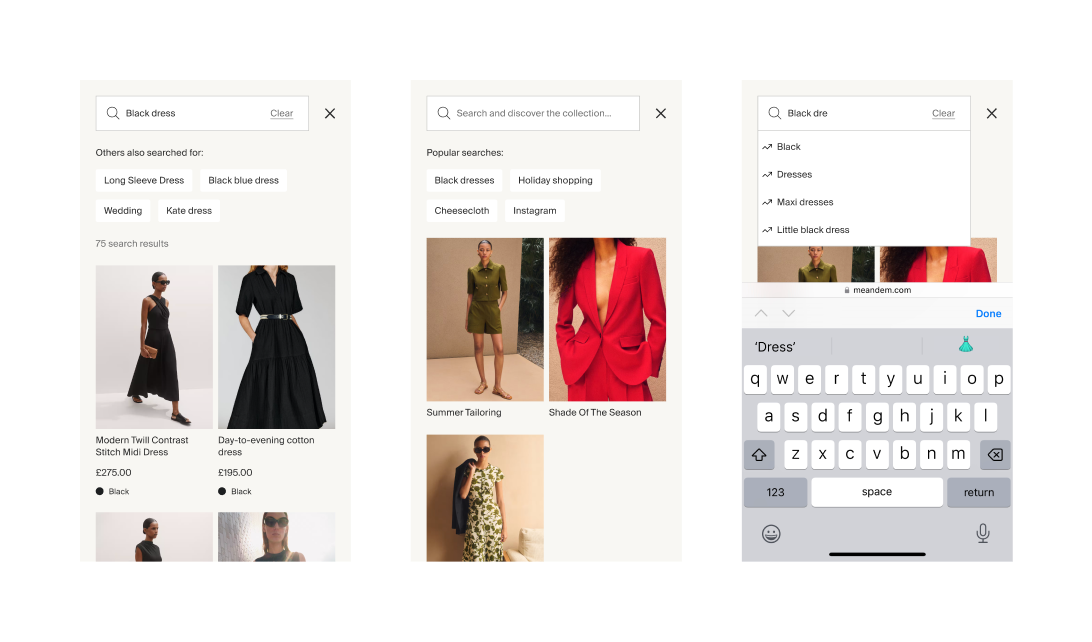
Validating Through User Testing
We defined and tested a clear North Star for the .com experience, grounding early concepts in both brand ambition and user needs. Through rapid iteration and feedback, we shaped a direction that elevated discovery, simplified navigation and ensured the experience felt cohesive, intuitive and distinctly premium across every touchpoint.