CASE STUDY
From forgotten feature to redesigned app hero product
Transforming a forgotten feature into a reader favourite by listening to readers; brining discovery, engagement and subscription together, into a unified product.
👨💻 My Role: Lead Product Designer
The newsletter section of the newspaper had become fragmented, hard to discover and underperforming. Engagement was low, the experience differed across platforms, and multiple codebases made iteration slow and costly.
I led the redesign of the newsletter experience across iOS and web, creating a single, scalable product powered by a shared React codebase and enhanced by personalisation.
Only 12% of newsletter sign-ups happened outside of onboarding.
🧩 The Problem
- Newsletter content was buried and difficult to find
- Subscription management was confusing and fragmented
- Engagement and sign-ups were declining
- iOS and web experiences were inconsistent
- Multiple codebases slowed down delivery and innovation
🎯 The Goal
- Reposition newsletters as a core product, not a side feature
- Improve discovery, sign-up and retention
- Create a unified experience across iOS and web
- Enable faster iteration through a shared codebase
- Introduce smarter, personalised content experiences
👨💻 My Role
Lead Product Designer
- Defined product direction and experience principles
- Designed end-to-end journeys across iOS and web
- Worked closely with engineering on React implementation
- Led design within a cross-functional squad
65% of users didn’t return after first visit.
Listening to Reader Signals
We analysed behavioural data to understand how readers were interacting with newsletters beyond onboarding. Signals like drop-off points, low revisit rates and limited in-product discovery highlighted where the experience was breaking down, helping us prioritise what to fix first.
Average time spent on newsletter pages was under 20 seconds
Just 18% of users visited the newsletter section more than once
High exit rate (~55%) from the newsletter landing page
88% of sign-ups came from onboarding, not in-product discovery
The Approach
We prioritised problems by mapping impact against effort, ensuring the most critical issues rose to the top. This process allowed us to focus on the areas creating the greatest friction for customers — from usability gaps to confusing journeys — while also addressing the biggest barriers to business growth. By tackling these high-value opportunities first, we built momentum and created a clear foundation for long-term improvements.
1.
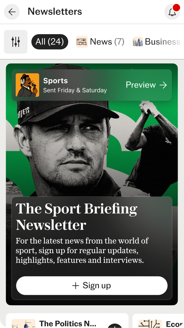
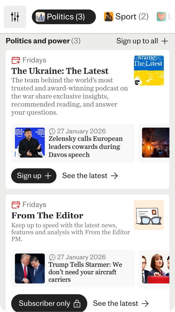
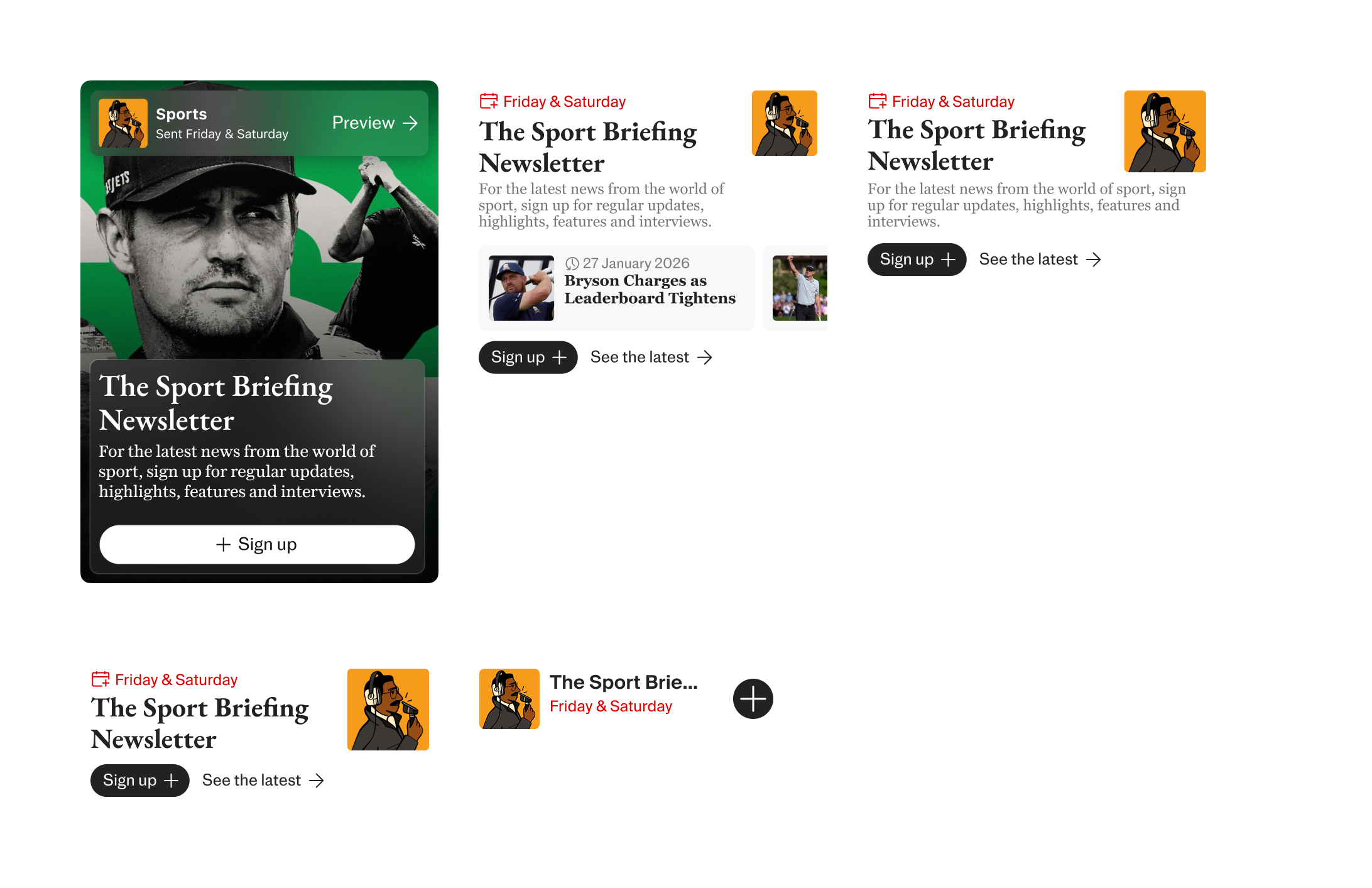
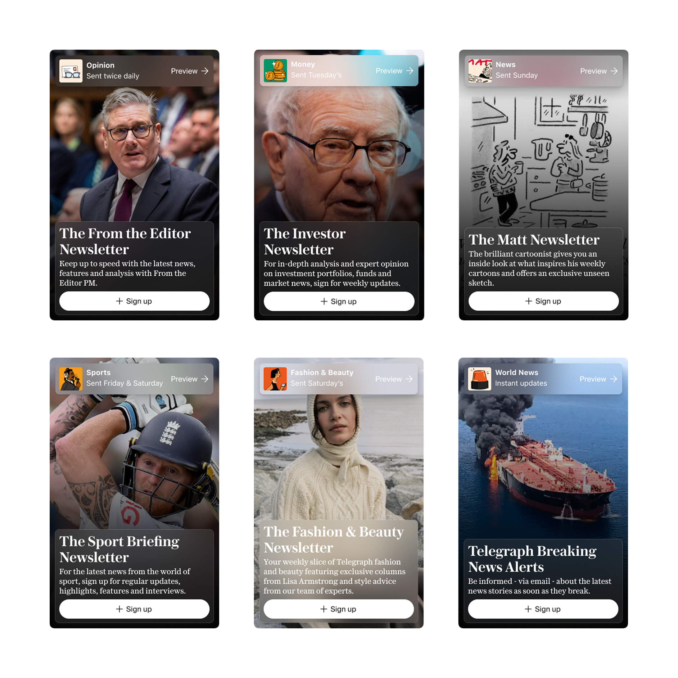
Reframing newsletters as a product
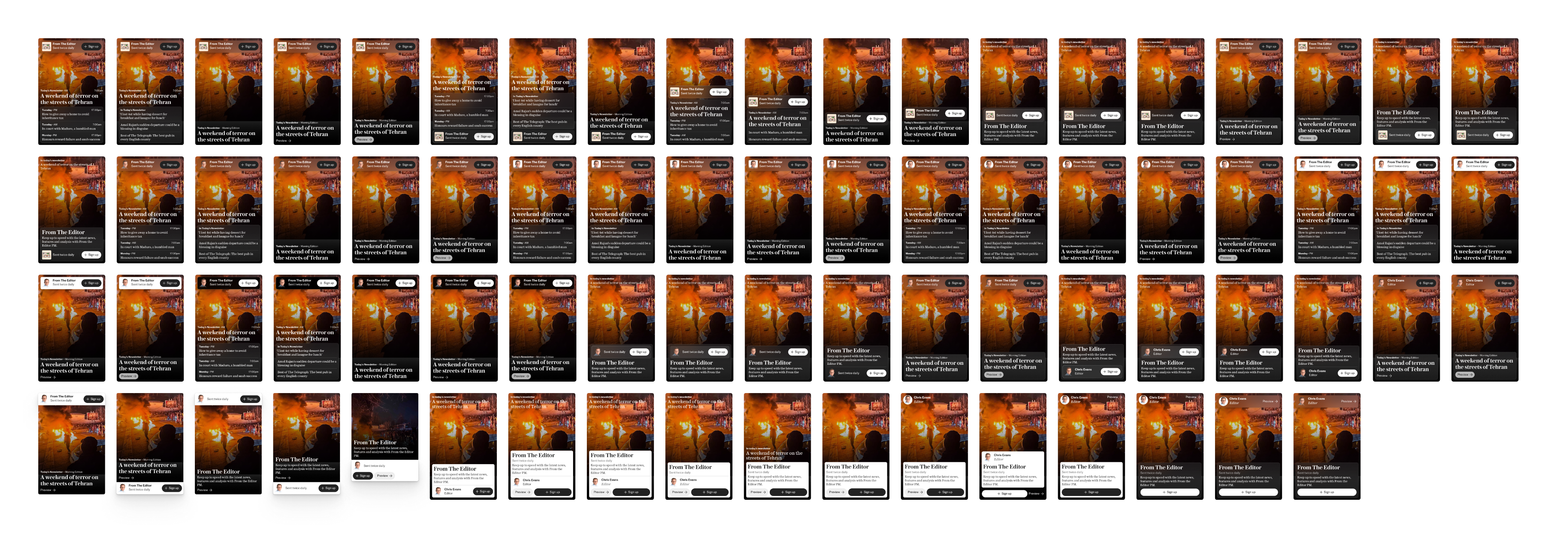
↗
Clear value propositions per newsletter
↗
Editorial identity and hierarchy
↗
Focus on habit-building and repeat engagement
2.
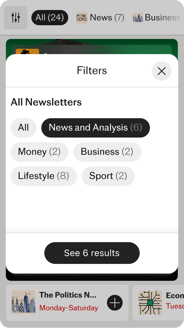
Unified experience across platforms
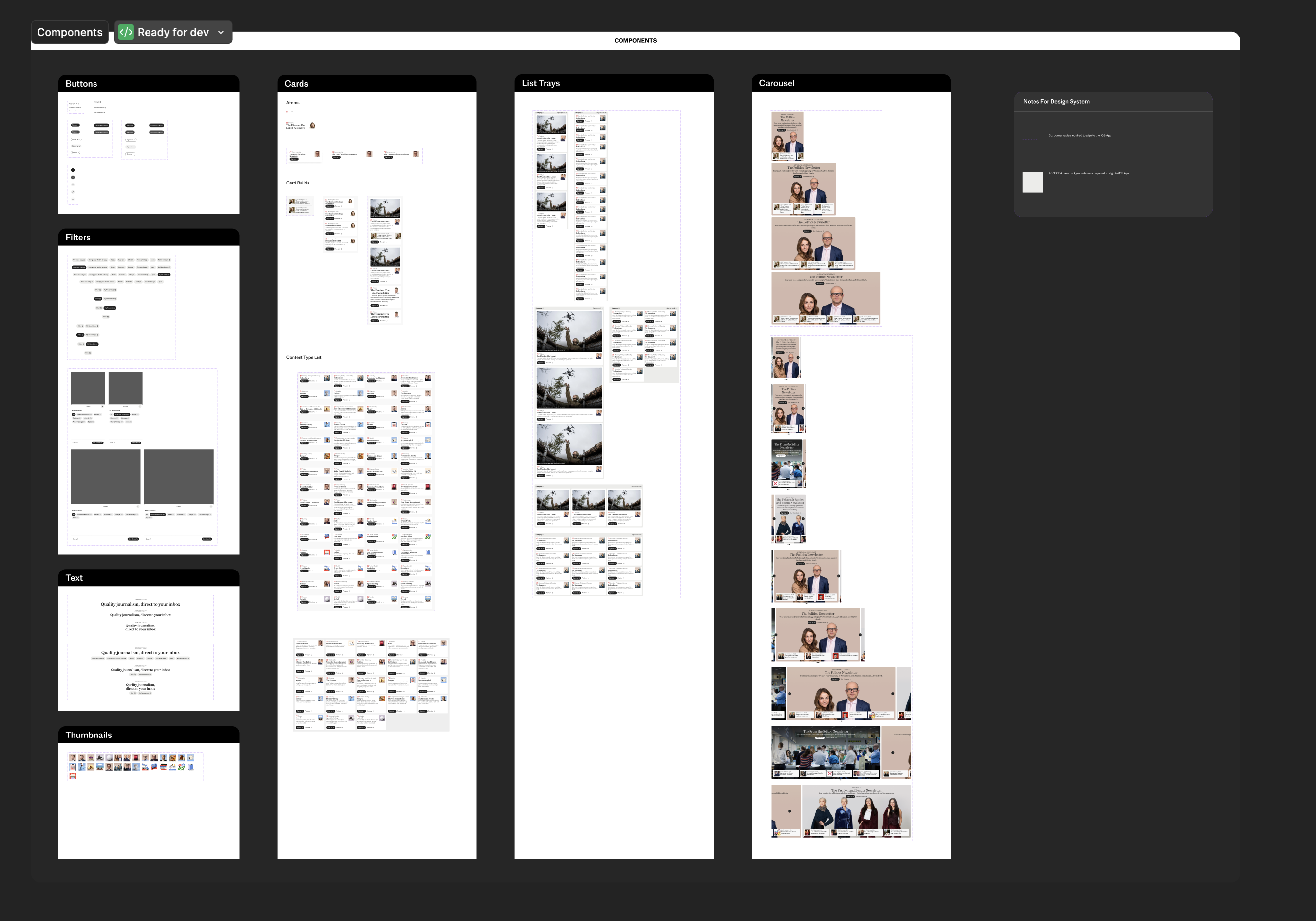
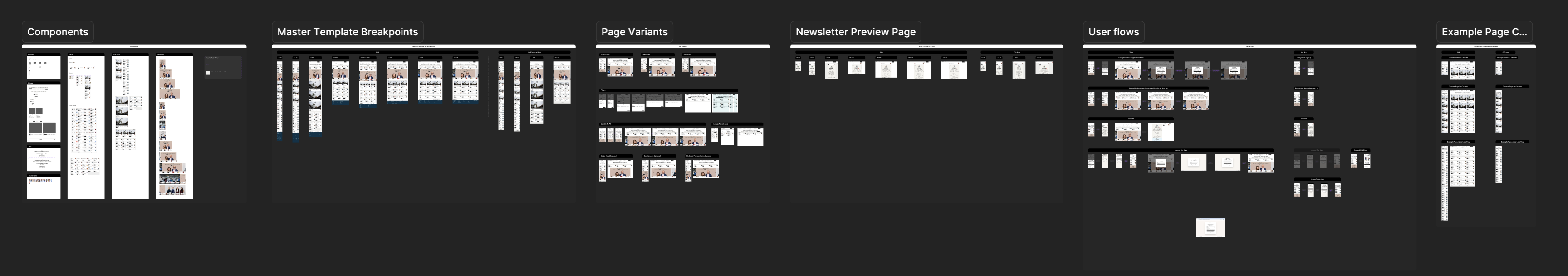
↗
Shared UX patterns and components
↗
Responsive layouts optimised for each platform
3.
One codebase with React
↗
Shared components across web and app
↗
Reduced duplication and engineering overhead
↗
Faster experimentation and release cycles
4.
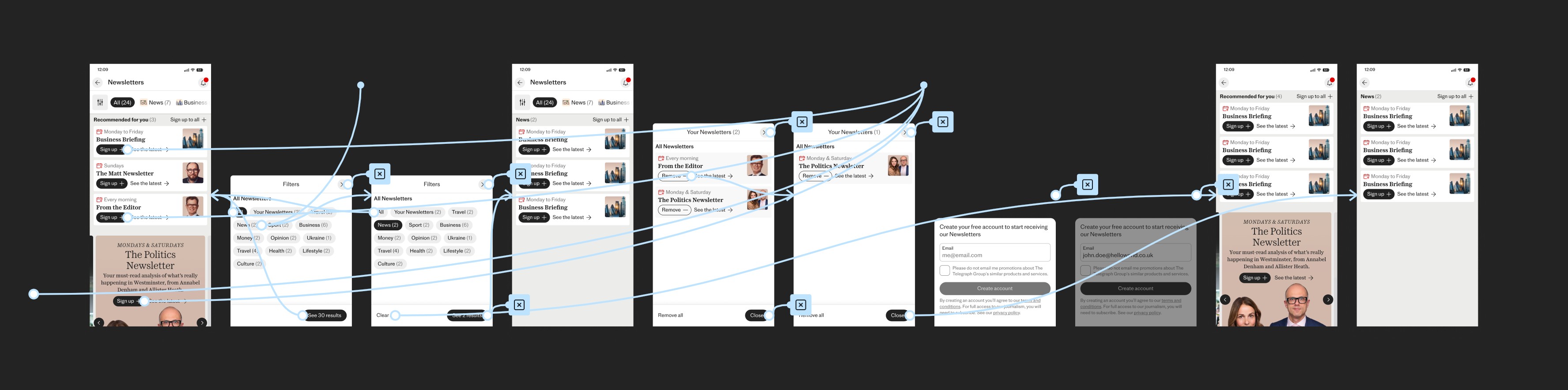
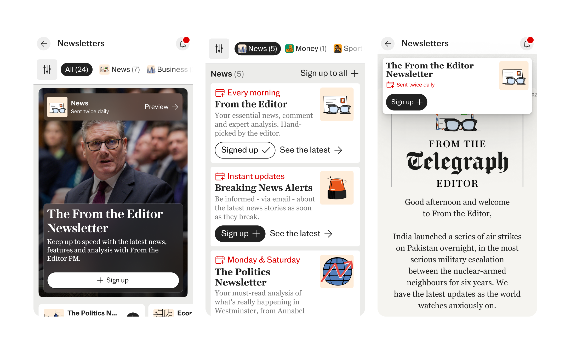
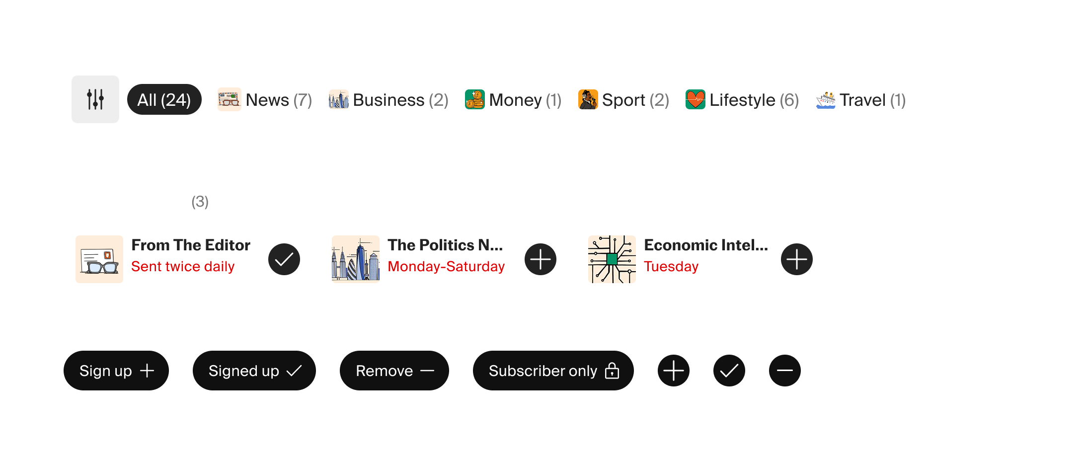
End-to-end subscription experience
↗
One place to view, manage and customise subscriptions
↗
Clear onboarding and sign-up flows
↗
Flexible frequency and preference controls
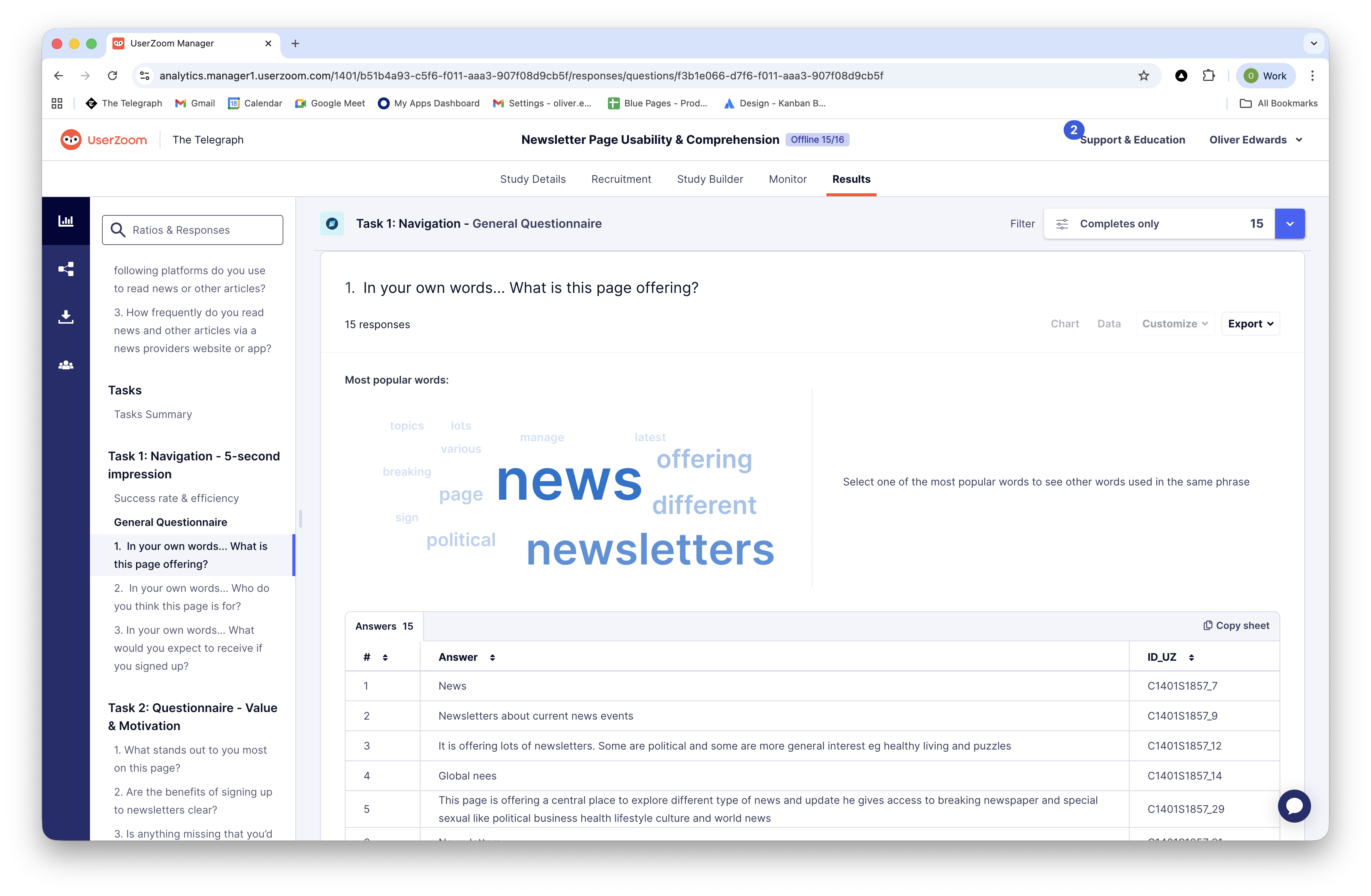
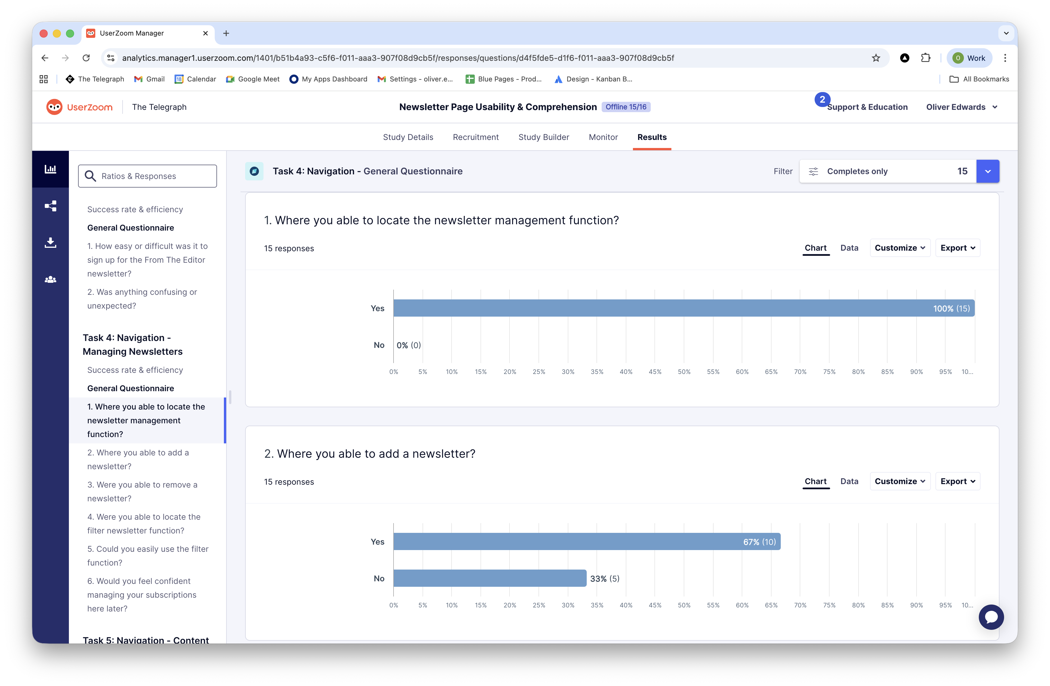
Validating Through User Testing
We tested early concepts with readers to ensure the experience felt clear, useful and intuitive. Regular usability sessions helped refine navigation, improve subscription flows and validate that the new approach to discovery and management was working in practice.
And yes, a lot of Figma iterations...